project overview
role
end to end UX design, UI design, user research, wireframing, prototyping & usability testing
scope
educational • no constraints
timeline
7 months • March '21 - August '21
project toolkit
Adobe XD, Miro, Optimal Sort, Usability Hub & Notion
project introduction
apparently, materialistic items can't buy true happiness, so why is it so hard to not spend?
brands make it their job to make not spending hard
my 6 years of experience in fast-moving-consumer good brands to create more products taught me that companies will fight ruthlessly for a proportion of our hard-earned salary, perpetuating the belief that acquiring their product will make you happier. the rise of e-retail has made it even harder to turn away.
but there appear to be users who are trying to fight back
look on pinterest or youtube, the trend of minimalism is here to stay, especially for millennials and even Gen Z. we're now interested to build better habits with what we spend their money on, moving away from materialism.

clippings from various articles and content found on pinterest and a google search of "how to shop more intentionally"
challenge
how might we help users be more intentional with their online purchases in a non-restrictive way?
hypothesis
an e-wallet product that gives users the ability to apply conscious purchase consideration at moments around the point of purchase will help users feel greater content with their possessions
user research
reaching out to users allowed us to explore this opportunity more intimately
I conducted user research consisting of two parts to learn about the spending behaviours of users and what things they may look for in purchase considerations
user surveys: gathering initial insights
I recruited millennials who have shopped online within the past 12 months.
80% of users are motivated to shop online because of a discount or offer
3/4 of users themselves define themselves as "frequent" online shoppers
67% of participants identify with shopping because of online ad's or content
67% of users expressed interest for an app that could help them have less
but why? further questioning was required
user surveys impacted the recruitment criteria of user interviews: we could learn a lot from users who are already "intentional" shoppers
overall, we spoke with the right audience. however, a small proportion of users shared responses that indicated they could already be "intentional".
recruiting such users for interviews could help us understand their attitudes and behaviours when it comes to online purchases, transforming their insights to build features based on real life practices
user interviews: an opportunity to dig those insights further
I invited 4 participants from the user surveys to be interviewed
2 x 'target' profiles: frequent online shopping habits, often exhibits high purchase regret, motivated by discount codes, targeted by adverts and content
2 x "intentional" profiles: infrequent online shopping habits, rarely exhibits purchase regret, motivated to shop by "well-thought through" needs only
top 5 key user interview insights + considerations
insight 1
target users know they should be more cautious when shopping, but they find it a highly enjoyable and positive experience
consideration 1
how can we design features that won't 'kill off' the general positive experience of shopping
insight 2
intentional users apply a long phase purchase consideration, target users find it difficult to frequently do this
consideration 2
we could help users apply a phase of consideration, like how our intentional users already do
insight 3
to users, creating another account means another product manage - this can feel annoying to them
consideration 3
look into open-banking, to give users access and management to all their accounts in one place
insight 4
users have dedicated bank accounts allocated to personal spending as a process of setting budget for expenditure
consideration 4
a pre-paid debit card could accompany Intently
insight 5
users get frustrated on regretful purchases more than impulse purchases. they don't always lead to regretful purchases
consideration 5
how can we design the features that won't 'kill off' the general positive experience of shopping

examples of questions that participants wish they could've asked themselves when they start to notice a regretful purchase
user persona
synthesising our learnings to create our persona: Esther
Esther was used throughout the project to keep in mind who we were serving and how features could be further tailored to her, especially when considering what design patterns she may already be familiar with
user research helped reframe our initial assumption about the problem - it's not about the money.
before starting the research we had naively assumed that target users would have equal frustration regarding the impact on their personal finances and level of fulfilment of their possessions when it came to "unintentional" shopping.
I was proven wrong, the users I spoke to had great measures such as budgets, savings accounts and investments in place. they identified with feeling in control with their personal finances.
problem statement was revised: removing any focus on spending intentionally for improving personal finances
problem statement: assumption
our users need an approachable & informative way to view and manage their money and purchases, because they desire to feel more in control of their finances and what they possess

problem statement: after
our users need a non-restrictive way to be more intentional with their purchases, because they often feel frustrating regret from not applying sufficient consideration
ideation
research insights shaped the features intently should offer
features
360° views of spending - of all your accounts
open banking connects all bank accounts in one place
send, receive and move money
and all the money features you would expect
conscious spending: impulse reflection
ask the future you, whether you "really need that" before you authenticate a potential impulse transaction
conscious spending: undo purchase
apply reconsideration windows for purchases you might frequently "instantly regret" for a second chance
ideation
defining the information architecture - make it feel "familiar" to users
the following thought informed my design strategy:
there is no precedent to the conscious spending features of intently, to not impact adoption, the standard e-wallet functionalities should feel as logical and intuitive to users as possible
I took inspiration from competitor products such as Yolt,
Money Dashboard &
Starling regarding:
- the umbrellas of their navigation: how many, how deep and what is connected? it seemed most adopted a form of co-existing hierarchy and all parent pages are accessible from each other
- the single-minded copy to describe the areas of their app for example, "transactions, controls, profile"
initial site map vs. refined site map w/ card sorting
I also took the opportunity to refine the site map by conducting an open card sort with 8 participants via optimal workshop.
whilst it helped inform minor amendments regarding groupings and category headings, looking back, this exercise was not as insightful as putting the high-fidelity prototype in front of users for feedback.
- this led me to reflect on the effort vs. usefulness of card sort exercises. my conclusion is that they are useful tools for quick sense checks, but due to the lack of context typical of this quick exercise, but only usability testing would expose the true intuitiveness of the navigation and structure
ideation
create quick task flows of features with no pre-existing design patterns
conscious spending features
before wireframing, I defined the parameters and settings that would trigger and activate the use of the conscious spending features. I started with a brain storm before proceeding to sketching out the task flows
I felt this was required and useful vs. other features of intently, as there aren't any existing competitor products I could learn from
ideation
prototyping intently through low, medium and high fidelities
learning: more detailed low-fid designs are OK!
'real' copy vs. placeholder copy was used to visualise screens and intended flow. whilst more time was consumed at a stage which should typically be rapid, it sped up the medium to high fidelity stages of development, allowing focus on interaction, also an important aspect of the user experience.
time expended felt justified as there are no existing or defined designed patterns to the key features we were exploring.
ideation
creating the right key moments to address the problem statement: "non-restrictive"
conscious spending feature: impulse reflection
how might we encourage Esther to think carefully about the intentions of her purchase without coming across as "restrictive", when it's likely we'll catch her during an adrenaline rush
looking back at our user persona, Esther regards the shopping experience as positive. intently's feature should try to preserve those emotions, especially if it's truly intentional purchase, but also without making her feel guilty
deliver the approval request to Esther in a way that feels familiar to a feature of a frequently used app of hers: Instagram stories
features that rely heavily on data input for success
like intently's sign up and set up of conscious spending features
how can we design the extensive account & feature set up aspects of intently to be easy and approachable to motivate completion
the success of intently relies on user inputs. without the user's perseverance to set up the features, the app would not function
informed by direct & indirect competitor references, utilise progressive disclosure, progress indicators and rely on recognition vs. recall where possible
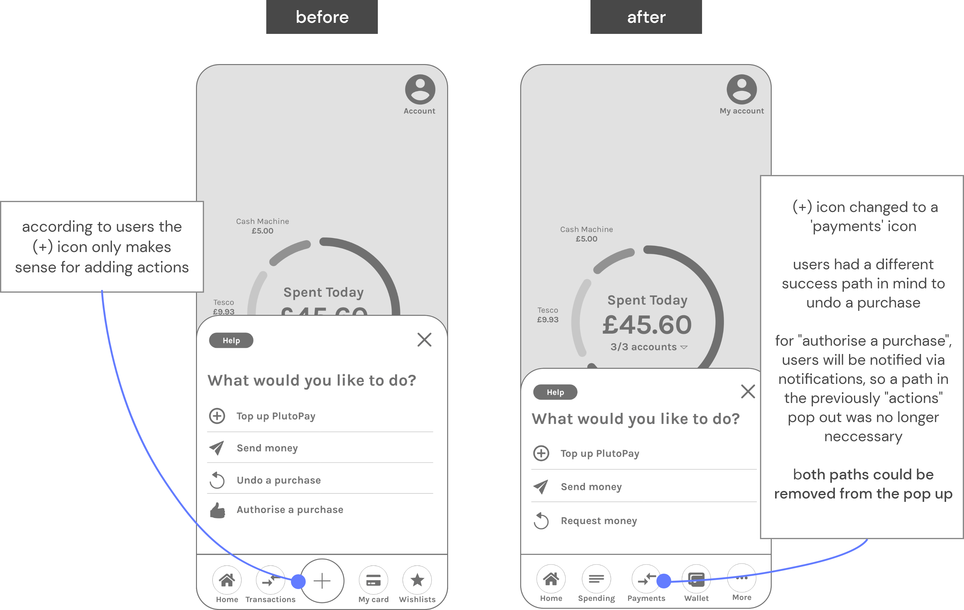
usability testing
challenging the prototype with real world users through testing
by observing users interacting with the intently prototype and completing tasks, we could reveal areas of confusion and uncover opportunities to improve the overall user experience
I wanted to understand if the proposition was understandable and whether the navigation of key features were clear, efficient and easy
usability test plan highlights
- I recruited 6 participants (millennial, online shoppers, users of mobile banking) via my personal network and conducted moderated-remote, task-driven usability tests
- For some trusty metrics for measurement, each participant was asked to rate each task on a scale of 1-7 regarding ease (Single-Ease-Question)
to see the full usability test plan document:
click herewhat did we ask participants to do?
01
"you've downloaded the app and you'd like to sign up"
sign up and add an bank account to intently
02
"you often discover old products you should use up first after you make online beauty purchases"
set up an "undo purchase"
03
"you bought face masks from lookfantastic, but you remembered you had some already"
search & undo this purchase
04
"your intently pre-paid card credit is running low"
top it up with £20 from your lloyds bank account
05
"you're someone that makes regretful purchases in fast-fashion"
set up an "impulse reflection "
06
"you've made an order on prettylittlething, intently will ask you to authorise it because of task 05
authorise this purchase
for the full usability test script document:
click hereusability testing
data consolidation and drawing the key learnings for refinement
after re-watching 6 hours of precious recording from the testing sessions, I collated all the useful nuggets of insights from my users into a rainbow spreadsheet - consisting of observations, positive quotes, negative quotes and errors
key features
based on user research, below are some of the experiences I feel would be important to our persona. further research and testing would likely uncover more use cases
impulse reflection feature
once the feature is set up for a specified type of transaction e.g. clothing, the user will be prompted to authenticate online orders that matches the defined preferences in the future
they will be taken through a cycle of self-reflection prompts. some are pre-selected depending on the type of merchant - but the user also has an opportunity to define their own prompts, for a more personalised experience
impulse reflection feature set up

impulse reflection feature in use

undo purchase
giving users a second chance to "retract" their online orders, an experience similar to gmail's "undo send" whereby the email is never really sent to the recipient until after the cancellation period
similarly through intently, online orders are pending until after the cancellation window, only after this window are orders received by merchants
in the flow shown below, LookFantastic was doing 20% off offer on Esther's favourite skincare brand, she hastily made an order but soon after realised that there are products she has that should be used up first. so she uses intently to cancel the pending transaction
undo purchase feature set up

undo purchase feature in use

send, receive & move money in one place
as one application, intently provides the user with capability to forget about the other mobile banking apps they own through 360° views of their spending through open-banking
send money

top up intently prepaid card

interactive prototype


.png)
.png)